Tuesday 26 June 2012
Monday 2 April 2012
Evaluation question 7
Looking back at your preliminary task, what do you feel you have learnt in the progression from it to the full product
Looking back at my preliminary task I think I have learnt lots of new Photoshop skills, and I have become much more confident with the software. I have been able to use skills where I can make my pictures look professional. I have also learnt new skills for my sell lines making them stand out better giving them a 3D effect and making them eye catching.
I have become more confident with experimenting with different tools and I have become more creative with Photoshop which has made my magazine stand out more, as my preliminary task magazine looks very boring and simple and I did not use a variety of text like I should do, however, i did in my music magazine and the different fonts I have used has made my magazine stand out and look good.
I also learnt how to surround my pictures with the sell lines, I found creating my contents page difficult however I think it has come out well. I had changed it three times as I did not know how to section it out well, or how i should fit the text around the image. Now i have sectioned out my text in different categories and I also used a large image, as well as small images so it doesn't look too boring and it shows some of the other articles which will appear in my magazine
Overall, i think my Photoshop skills have grown and you can see this by the outcome of my magazine as i think it has turned out good and looks professional.
Evaluation quesion 6
What have you learnt about technologies from the process of constructing the product?
I have learnt a lot about the different technologies available to me when creating my magazine. I first learnt how to use a professional camera as I had to do a photo shoot and have a different variety of images for my magazine so that I can pick the best images to appear on my magazine. I think I have been able to use this skill well as some of the images I have taken have come out very effective. I created different angles like a low angle shot by standing on a chair, and used a close up to create a close up
I used Photoshop throughout the production of my magazine, I learnt how to cut my image fast by using the quick selection tool, which is a faster version of cutting out the image, and then I used the smooth and refine edges tool to smooth out any bits of my image. I also used a tool where I can brighten up the image to stand out and look bold and effective and I used this on my front cover to catch the reader’s eye and on one of my double pages spread where the picture stands out and looks effective. In using these tools my pictures have turned out good and they look professional.
While creating my sell lines I used effects to make my sell lines stand out. For my mast head I used a 3D effect so it stand out well, for the rest of my sell lines I used drop down shadow effect also creating an eye catching 3D look.
I feel like I have learnt many new skills while creating my magazine, and this has helped me make my magazine look professional and I was able to make my images stand out as I was able to change the colour range on my image and I was also able to cut the image out easier to make it look professional. Using a professional camera has also helped my picture taking skills and I have also learnt the importance of lighting I was also able to have a variety of angle shots.
I also learnt how to use premier well while creating the videos for my evaluation, I found it difficult at first to get used to it however after creating three videos I finally got the grasp of it. I also started using Blogger, posting all the tasks that I have had to do, I found blogger using blogger strange at first as it is something im not used to doing however, I like using it now and find it easy.
Friday 30 March 2012
Evaluation quetsion 5
How did you attract/ address your audience?
For my magazine, I ensured that it would sell by including the main aspects of an indie/rock genre magazine. Firstly, I ensured that my front cover looks good and would appeal to a young adults by making the colour scheme red, black and white and silver these are the main colours used for a indie/rock genre magazine. I included a large red masthead and made it eye catching for my audience. The colours are also a uni-sex so I gained a wider target audience.
On the front cover and contents page I included sell lines which will appeal to my target audience because they are sell lines which my audience will want to read about in the article, for example i have included the latest about singers and bands so they will be able to read about their favourite singer or band. I have also included gig listening as my target audience are people who regularly go to gigs and enjoy it. My article is about a new singer, this will appeal to my audience as they want to know what else the musician will be doing.
On the front cover it is a close-up of my musician who is a female; this will attract both women and men. The price of my magazine is £3.50, it is expensive however, teenagers will be able to afford it as they are most likely to ask their parents for the money, young adults will be able to afford it as they will probably be working so it is easier for them to afford it as well.
My target audience are quite young and I have ensured that they can access my magazine in many different ways by including a facebook and twitter website as well as an Iphone app, as young people are more likely to use the internet access things, as they are likely to have a smart phone and have internet on their phone so they can easily access the iphone app, and if they have a Blackberry or other type of smart phone they can easily use the internet on their phone to go onto the twitter or facebook website.
I have tried to give my magazine a certain style of writing as the Uses and Gratification theory say that people who read magazines try to have a personal relationship with it, and read magazines for an escapism therefore, I have used writing where my reader feels comfortable reading it and I have included pictures and different articles about different artists, gig and album reviews so that every page is different and my reader can enjoy reading each different page.
I have included the colours red, white grey and black these are colours which are associated with the genre of my magazine. The colour red stands out and so therefore I used that colour for my masthead so that the reader is immediately drawn to it. I used effects on my sell lines such as drop down shadow and bevel emboss so that they are eye catching and bold.
Wednesday 28 March 2012
Evaluation question 4
Evaluaion Question 3
Another reason I have targeted my audience at young adults is because 16 years old will have parents who are likely to pay for the magazine issues. My magazine is aimed at both male and females, and I think my magazine does this well as the front cover has a picture of a female which will attract males as well as females and the colours I have used colours which are very mutual and so they should appeal to both genders.
The social class for my will be B-D, my magazine it monthly but it is £2.99, quite expensive but social class C and D will be able to afford it. They would be people who are at college or university which is why my price is not too expensive, because when you are a student and young adults starting the world of work.
I think my target audience will share the same sort of social habits they are likely to dress the same, have the same interest which is why in my magazine i included exclusive interviews which I know would appeal to them, I also included when the latest gigs will happen, which will also appeal to my audience as they are likely to enjoy going to gigs and concerts.
Who would be the audience for your media product ?
I have targeted my audience at young adults from the ages of 16-25, because teenagers develop what type of music they are in to at the age of 16 and older. Young adults/adults are more likely to buy my magazine because they are more likely to want to read about reviews and upcoming gigs. They have probably already experiences going to a gig/concert.Another reason I have targeted my audience at young adults is because 16 years old will have parents who are likely to pay for the magazine issues. My magazine is aimed at both male and females, and I think my magazine does this well as the front cover has a picture of a female which will attract males as well as females and the colours I have used colours which are very mutual and so they should appeal to both genders.
The social class for my will be B-D, my magazine it monthly but it is £2.99, quite expensive but social class C and D will be able to afford it. They would be people who are at college or university which is why my price is not too expensive, because when you are a student and young adults starting the world of work.
I think my target audience will share the same sort of social habits they are likely to dress the same, have the same interest which is why in my magazine i included exclusive interviews which I know would appeal to them, I also included when the latest gigs will happen, which will also appeal to my audience as they are likely to enjoy going to gigs and concerts.
Evaluation question 3
What kind of institution might distribute your media product and why ?
I wanted my magazine to be distributed by Hearst magazine UK, I did not want my magazine to be distributed by ICP as they distribute magazine such as 'Q', 'NME' and 'Kerrange!'. This would then increase my competition, as 'Tune' is a similar magazine to the magazine distributed by ICP which would make it difficult for my magazine has its own identity and popularity.
Hearst magazine UK is well known for distributing fashion and life style magazine such as 'Cosmopolitan' even though this is not a music magazine, the distributor will be well known and my magazine will attract other types of magazine as well as my own.
I think that Hearst magazine will be a suitable distributer for my magazine because my magazine will be the first magazine that they will distribute and for it to be successful they will make a marketing campaign and will have a large enough budget to make the magazine attract a target audience.
Hearst magazine distribute magazines for male and female audiences and my magazine is also aimed at both genders. I think this would be good for Hearst magazine to distribute my magazine because they will be the first fashion and lifestyle magazine to be distributing a music magazine which would be an advantage for them to be distributing and launching a new magazine which will attract and gain the attention of a large target audience.
Evaluation question 2
How does your media product represent particular social groups?
For my magazine I think I have represented my social group quite well. The look of the magazine looks like it’s aimed at upper class/ middle class. The effect of using grey in my front cover makes my magazine look sophisticated, I also used and black white and this make my magazine look elegant as black and white complement each other well. The added effect of red makes my magazine stand out, and you can also tell what the genre of my magazine is.
For my front cover, I tried to create sell lines which would relate to my tagret audience, for example I used 'best album 2011' this would appeal to my audience who are frequently listening to indie music and who will want to know the best album for 2011. The colours that i have used represent the genre well, which attracts my target audience. I also think that the image I used represented how I wanted my musician too look, I made her pose in her picture so it looks dangerous. Danger is something that relates a lot to a Indie/rock magazine, and I think I have represented it well, the picture is a close up so you can see her facial expression quite well and the audience can relate to her.
Another page which I thinks represents my social group well is my first double page spread, as I think the image that I used is very exaggerated and even though there is only a pull quote on the page, the page says a lot. I think the picture looks quite upper-class from the way it has been taken and the font I used for the pull quote adds a sophisticated look as I made the font italic which adds the extra effect.
Furthermore, the Mise-en-scene of my magazine represents the social group of my magazine well, the look of my model looks quite middle class/upper class, in my article draft I made her wear red high heels again the colour red because it related well to the genre of my magazine as well as making my model look sophisticated and glamorous. The clothes that my model wears are stylish, and make her look like a rock chick which adds to the look of the genre of my magazine. It also appeals too teenagers in middle class because her clothes are quite normal looking. I think that the front cover pictures represents my social group well it adds to the elegant look of the magazine, a close-up shot of her adds an up class effect to the overall look.
The tone of the article is something which will appeal to a young audience, the article is about a musician who is a new comer and has succeeded well for an Indie artist. This will appeal to my audience well as they'll want to know more about her success and what else she has lined up for her fans. I used two pictures and enlarged them, one of the pictures she is wearing clothes which really represent her image and the magazine well, I think wearing a leather jacket shorts and a top represent the magazine well the red heels balance it out by making her look glamorous and devious.
Evaluation question 1
In what ways does your media product use, develop or challenge forms and conventions of real media products?
The magazine that I have created does follow the typical conventions of a Indie/Rock magazine, I wanted to follow the main aspects of this type of genre so that the audience could recognize it straight away. I wanted to follow the typical conventions so that it is easy for my magazine to fit in with the genre, however, even though I followed the styling of an Indie/Rock magazine I do think that I created a magazine that has its own identity and style. I did this by looking at other Indie/Rock magazines and got some ideas to add to my own magazine.
For my front cover, I used the colours black, red, grey and white so that the audience can immediately realise the genre off that magazine, I added white to my colour scheme to make it look slightly different. I knew that my magazine has to be eye catching so that it can instantly grab the readers eye and I did this by making the masthead of my front cover red bold and large with added effects to make it stand out more. The image I used is a typical close up off my model, I think that it makes the magazine look more effective and the image looks eye catching, I also think that being able to use a close up means that I can have less sell lines around my front cover and the main focus can be on the image to make my magazine look more effective.
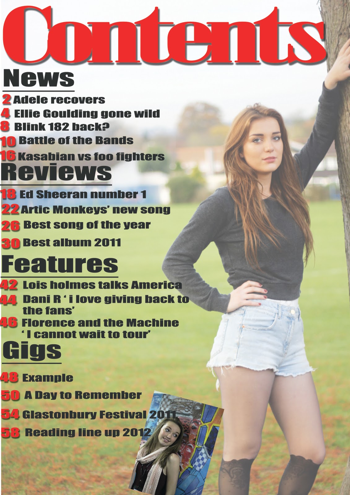
For my contents page, I changed the look and I think this is how I changed it to have its own identity. I created different sections the same in all contents page. But I used a long-shot image and used that as my background and faded it out a little so it wasn’t the main focus. The colours that i’ve used are red and black, red page numbers and black text. I've sectioned it out easily so that the readers can see what categories they want to look at.
I created two double page spreads, my first double page spread is a large mid-shot picture off my artist, i used an outdoor picture which is different and I think it looks really effective, i also added a pull quote on top of the picture. They both make the double page spread look effective. I used the colour red for the pull quote but a darker colour as it complements the picture as the background in the picture is dark green because of the blurred effect of the trees you can see in the background.
For my second double page spread, this is where the main article is. I used two pictures and fitted the text around the picture so it looks professional. The pictures I used look effective i enlarged them to fill the page up and make the stand out more. My model is wearing red heels in one them with goes with the red theme of my magazine and also makes her look dangerous as well as love and it goes with her Indie/Rock image. The clothes that she is wearing make her look like an Indie/Rock artist. The colour that I used is black and dark red which goes with the previous double page spread that I created.
Wednesday 21 March 2012
Tuesday 20 March 2012
Tuesday 28 February 2012
Monday 20 February 2012


Wednesday 25 January 2012
diary entry 15
Today in AS media, I started to work on improving my contents page as I think its the page which needs the most work done. I think I'm going to leave my front cover the way it is because I am happy with the way it looks and think I have represented the genre of the magazine well enough. I have completley changed the look of the contents page, added a different image changed the sizing of the fonts and added subcribtion websites. Once I get feed back from my contents page I will start improving my second double page spread.
Tuesday 17 January 2012
Diary entry 14
Today in AS media, I finished evaluating each page. I have taken on board some of the improvements and considered a lot of them and I have a idea in my head how I can act on this. The first improvements I am going to act on is on my contents page as its my weakest page.
Wednesday 11 January 2012
feedback for double page spread 2

One of the improvements I got was to add a heading, I agree with this and i will do this by making the image on the right smaller and moving the text along to right so that I can create space at the top and adda heading as i think that it looks quite white and plain without the heading. Another improvement I got was to change the colour of the text so that its obvious what the question is to the asnwer, I think I will change the question colour too red so that i stick to my colour scheme .
feedback for double page spread 1
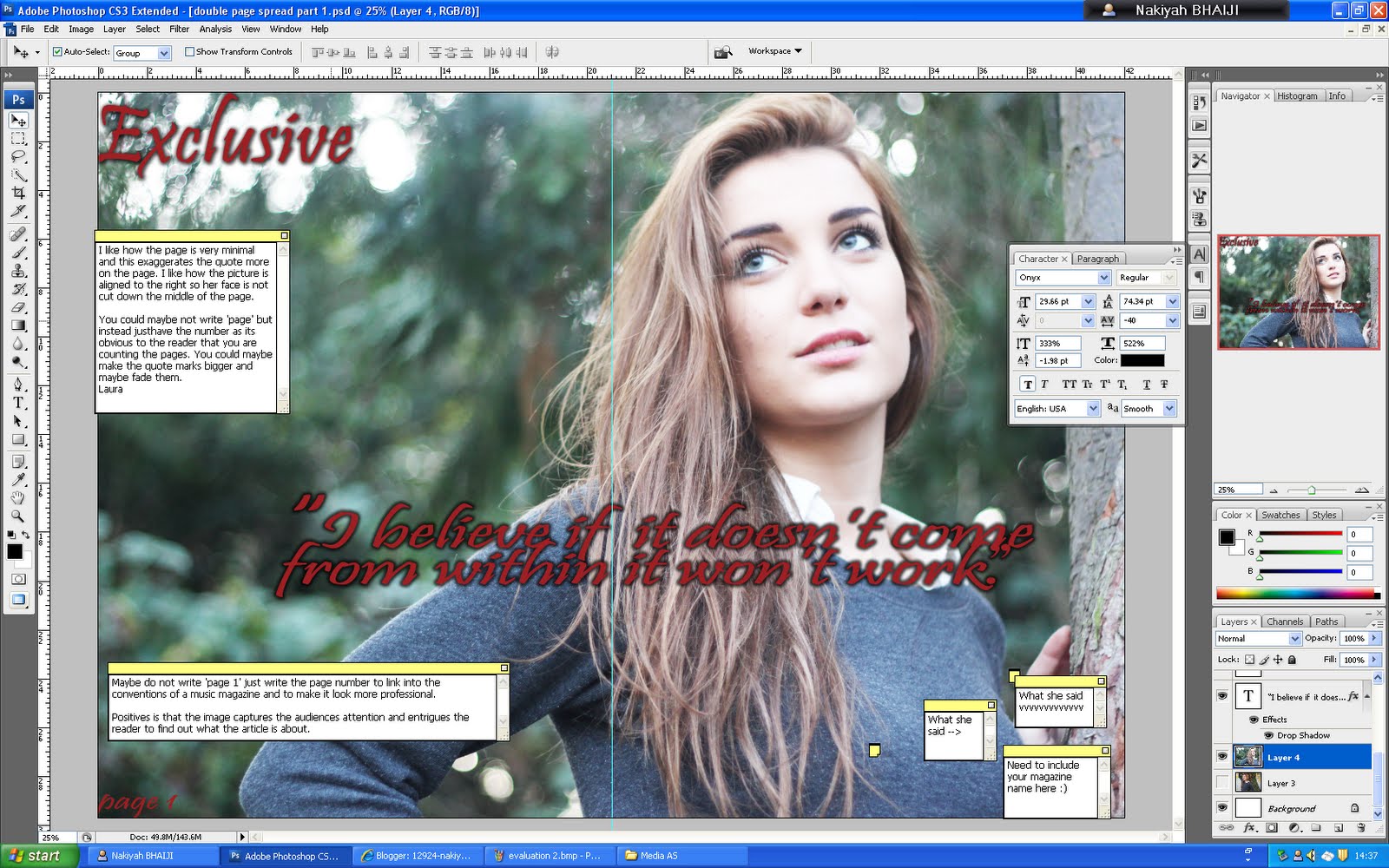
One of the improvements 'I like how the page is very minimal and this exaggerates the quote more on the page. I like how the picture is aligned to the right so her face is not cut down the middle of the page.
You could maybe not write 'page' but instead justhave the number as its obvious to the reader that you are counting the pages. You could maybe make the quote marks bigger and maybe fade them.
Laura' - This is an improvement which I agree with and I will act on it. Another improvement that I recieved was. I also need to add the name of the magazine so that the audience know what magazine they are reading this article from.
feedback for contents page

One of the improvements I got was 'Positives about the contents page is that you have clearly divided you contents page up into sections which makes it easy for your reader to navigate to their desired page.
Possible improvements to be made on this page is to possibly include some information about what type of subscription your magazine offers and if your magazine is linked to any social networking sites. :D
- Sonia' I am going to act on this comment and include the subscription when i have fully completed the contents page as it is not completely finished. Another improvement that I got was 'The image looks effective faded because it still makes the text stand out, but also fills up the page at the same time.However i would maybe change the positioning of the second picture so its straight and add an effect to it with maybe more images aswell. Also you could add the twitter and facebook logos at the bottom of the page :) ' and I will do this as i think it looks quite plain and it needs other pictures so that the reader can read about other articles and they'll know who's in it by looking at the picture. I think that my contents page needs most work because I have not finished it properly, and I know I need to add more too it.
Feedback for front cover

One of the improvments I got was 'I like the use of the colour scheme of red, grey, and white as it creates a sense of consistency in your magazine.
Possible improvements would be to make important text stand out e.g. 'Lois' possibly in a bigger font because she is the main artist of the magazine. Additionally, improve the text in your button e.g. make the text bigger or capitalise it. :D' I think that this is something i cann improve on, I could do this by making the 'Exclusive' smaller so that there is room for me to make 'Lois' bigger as she is the main focus and the audience needs to be drawn to her. I also think that I can make the button more interesting I can do this by adding an effect to the text inside the button. Another improvement I got was 'The font's here look inconsistent and I can't read "Lois reveals all" unless I focus. Try including an effect to make it stand out. (Bevell and Emboss I think) - Max ' however I do not agree with this as you have to show a variety of fonts on a front cover magazine and I have only used 3 fonts but they look different because i have changed the size and made it quite compacted together.
Tuesday 10 January 2012
Diary entry 13
Today in AS media, we started started to evaluate each others magazine. Once we finished evaluating each others magazine we had to sit and read the feedback that were given to us and analyse what was written and say whether we agreed or disagreed with the comment for each page. Bellow you can see that i have started doing this and need to finish it.
Monday 9 January 2012
Diary entry 12
I have finally finshed the first draft of my magazine, I made a draft front cover contents page and I created two double page spreads. Out off all my drafts I think that my contents page needs the most work as its lacking some aspects of a contents page, and I need to add more pages to it. I am happy with the pictures that I have use and they symbolise each page well.


Subscribe to:
Posts (Atom)