Pages

Wednesday, 11 January 2012

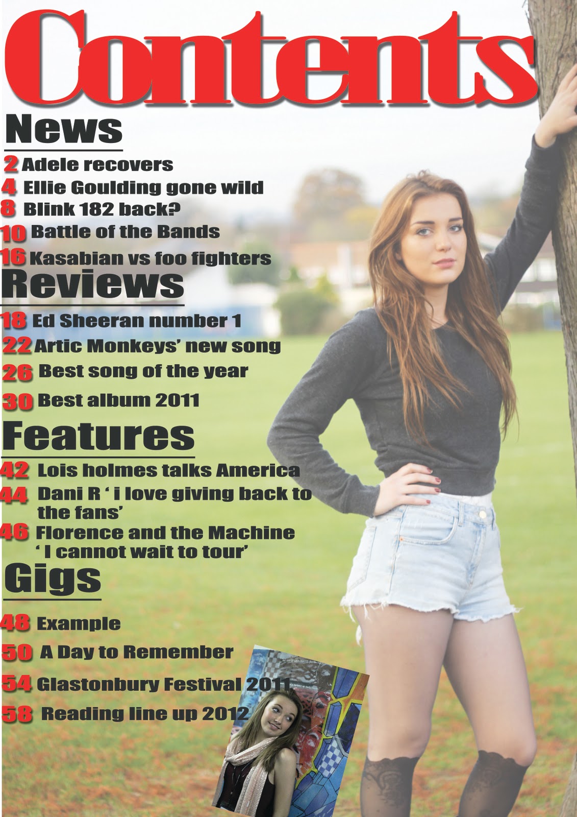
feedback for contents page

One of the improvements I got was 'Positives about the contents page is that you have clearly divided you contents page up into sections which makes it easy for your reader to navigate to their desired page.
Possible improvements to be made on this page is to possibly include some information about what type of subscription your magazine offers and if your magazine is linked to any social networking sites. :D
- Sonia' I am going to act on this comment and include the subscription when i have fully completed the contents page as it is not completely finished. Another improvement that I got was 'The image looks effective faded because it still makes the text stand out,  but also fills up the page at the same time.
However i would maybe change the positioning of the second picture so its straight and add an effect to it with maybe more images aswell. Also you could add the twitter and facebook logos at the bottom of the page :) ' and I will do this as i think it looks quite plain and it needs other pictures so that the reader can read about other articles and they'll know who's in it by looking at the picture. I think that my contents page needs most work because I have not finished it properly, and I know I need to add more too it. 

Feedback for front cover


One of the improvments I got was 'I like the use of the colour scheme of red, grey, and white as it creates a sense of consistency in your magazine.
Possible improvements would be to make important text stand out e.g. 'Lois' possibly in a bigger font because she is the main artist of the magazine. Additionally, improve the text in your button e.g. make the text bigger or capitalise it. :D' I think that this is something i cann improve on, I could do this by making the 'Exclusive' smaller so that there is room for me to make 'Lois' bigger as she is the main focus and the audience needs to be drawn to her. I also think that I can make the button more interesting I can do this by adding an effect to the text inside the button. Another improvement I got was 'The font's here look inconsistent and I can't read "Lois reveals all" unless I focus. Try including an effect to make it stand out. (Bevell and Emboss I think) - Max ' however I do not agree with this as you have to show a variety of fonts on a front cover magazine and I have only used 3 fonts but they look different because i have changed the size and made it quite compacted together.

Tuesday, 10 January 2012

Diary entry 13

Today in AS media, we started started to evaluate each others magazine. Once we finished evaluating each others magazine we had to sit and read the feedback that were given to us and analyse what was written and say whether we agreed or disagreed with the comment for each page. Bellow you can see that i have started doing this and need to finish it.

Monday, 9 January 2012

Diary entry 12

I have finally finshed the first draft of my magazine, I made a draft front cover contents page and I created two double page spreads. Out off all my drafts I think that my contents page needs the most work as its lacking some aspects of a contents page, and I need to add more pages to it. I am happy with the pictures that I have use and they symbolise each page well.